Create a brand identity that helps differentiate Tango in the crowded space of peer-to-peer network communications.
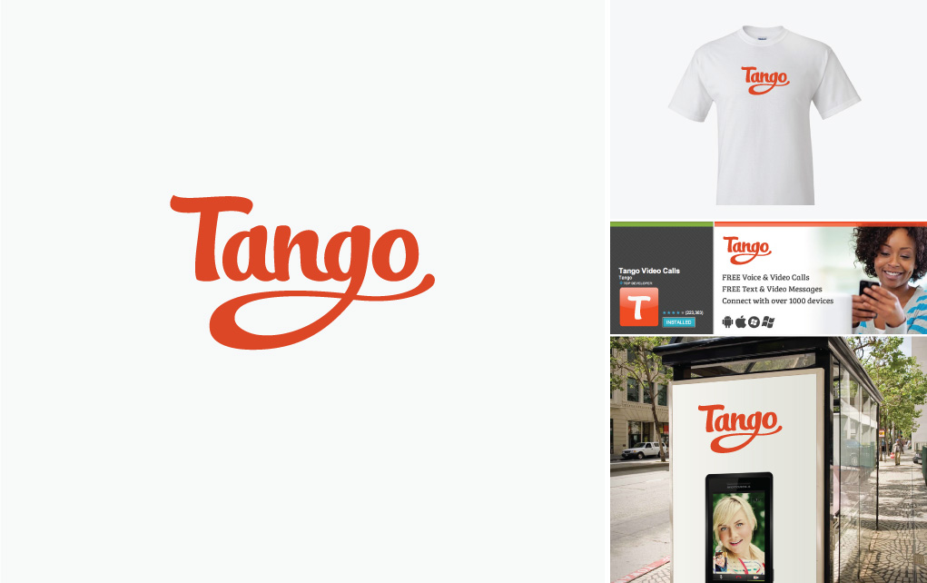
The loose and thick font style gives a subtle nod to the original logo, while the tail of the "g" supports the word mark and references the idea of connection of one thing to another. Overall, the feeling of "fun" is preserved and the concept of connection is elevated.
